Table of Contents

What is the Box Model in CSS?
Similar to the Document Object Model (DOM) that we explored in the prior lesson, the Box Model can be explained simply, or we can get into tons of nuance.
It is best described visually via the Firefox Developer Tools (we talked a lot about these in prior lessons).
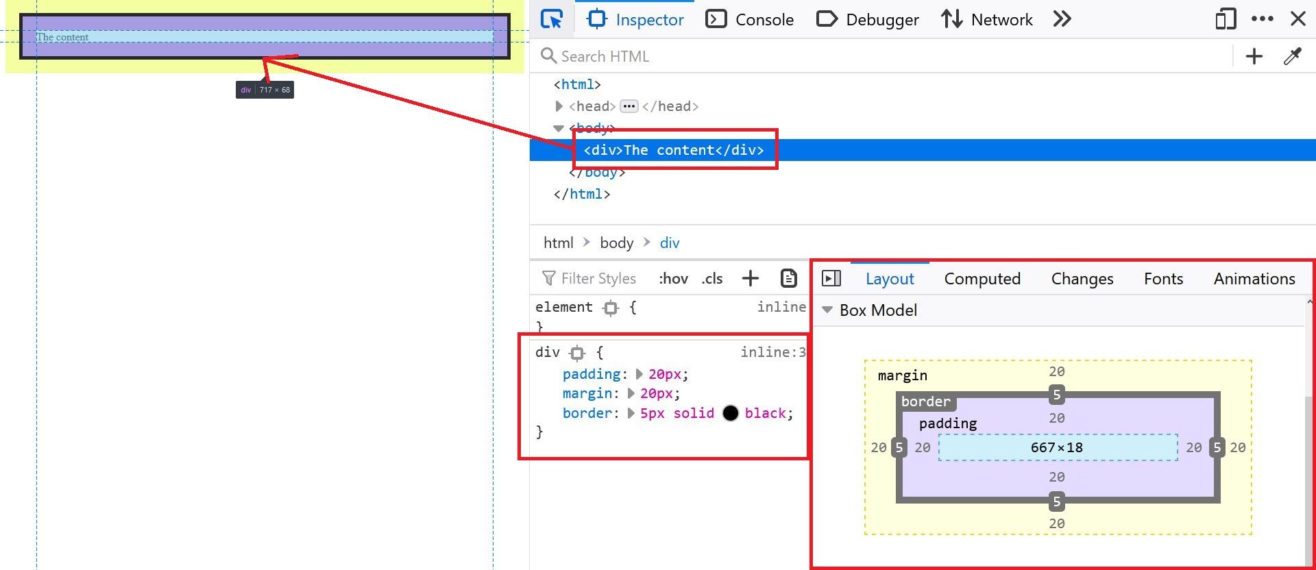
This is saying that our p element has content dimensions of 667 pixels x 18 pixels, has 20 pixels of padding on all four sides, has a 5 pixel border, and has 20 pixels of margin on all four sides.
The Box Model attempts to describe how much "space" an element takes up on the page. The following properties influence that "space" that the element occupies. I suggest skimming through their documentation.
But these are not the only properties that come into play when we talk about the Box Model. It is often difficult to introduce this model to beginners because there are several combinations of properties that will completely change the "rules of the game".
To better explain these "rules", I have created an interactive Codepen that we will be using to better understand the Box Model and all of its nuances. Keep this open in another tab while you read the following sections so that you can see in real-time what I am talking about.
Element Display Types
The display CSS property is arguably the most diverse CSS property there is.
Here are the possible values you can set for it.
display: none- Hides the element from the pagedisplay: block- The default display type for most HTML elementsdisplay: inline- The default display type fora,span,img,button,input, and several other HTML elements.display: inline-block- A mix betweenblockandinline(more on this in a minute)display: flex- Enables the Flexbox framework (out of scope for this tutorial)display: grid- Enables CSS Grid framework (also out of scope)
The display: none value is easy to grasp. Open up the Codepen from above and change the "Display Type" dropdown to "none". The orange box will disappear.
The block, inline, and inline-block properties require a bit of an explanation. Let's jump in.
Block vs. Inline Elements
Most elements will have display: block as their default state. Open up the Codepen example from above and reset all the values.
By default, it has a "block" display type. This means:
- The orange paragraph element will occupy 100% width of its container because we have not explicitly set a height or width (they are both set to auto)
- The orange paragraph is on its own line
Now, set the "Content Width" to 400px and "Content Height" to 200px using the dropdowns. The orange paragraph element should change sizes.
Reset all properties.
Now change "Display Type" to "inline". You should see the orange paragraph element jump up to the same line as the green text that was formerly above it. With an "inline" element, the following behavior happens:
- The element will only occupy the height and width of the content within it. In this case, that content is the text, "Some Content".
- The element will not break on a new line
Now, change the height and width properties using the dropdown again. Nothing should happen. That is because when an element is "inline", it does not respect its width and height properties.
Without resetting anything, change the display type to "inline-block". What happens?
The display property inline-block is the same as inline except that it respects its width and height properties.
Box Model Variations
Another property that will change the "rules of the game" is the box-type CSS property. It does not affect the flow of the elements on the page like display does, but it affects the calculation of how much space an element occupies. Here are the two values.
box-type: content-box- this is the default valuebox-type: border-box- as you will see, this is easier to grasp and often preferred among developers
To see this in action, open up the Codepen from above again, reset everything, and then select the following options.
- Set the content width to 400px
- Set the content height to 200px
Now, toggle between the two "Box Type" dropdown options. Notice how the size of the orange paragraph element changes by a small amount?
To make this more noticeable, change the "Padding" option to 20px. Now, toggle the box type again. Now, you should see large changes in size. This is because when you are using the value border-box, the total size of the element will be equal to its height and width. When using a value of content-box (the default), the size of your element is the summation of its dimensions, padding, and border.
Let's look at that screenshot from earlier.
In this example, we have the following "specs".
- Element width of 667 pixels
- Element height of 18 pixels
- Padding of 20 pixels (all sides)
- A 5 pixel border on all sides
- Margin of 20 pixels (all sides)
With box-type: content-box, the total height of this element is 18 + 20 + 20 + 5 + 5 pixels, or 68 pixels. Here, we add the element height, bottom padding, top padding, bottom border, and top border. Notice that we did NOT include the margin. Margin surrounds the element, but is not part of the element. We could also calculate the width as 667 (width) + 20 (left padding) + 20 (right padding) + 5 (left border) + 5 (right border), to get 717 pixels.
With box-type: border-box, the calculation is much easier. The total "space" occupied by the element is its width and height. If you add padding or a border, the size of them will reduce the content area of the element, but not the total space occupied by the element.
The border-box type is a bit simpler to understand and makes your job quite a bit easier when trying to fit elements inside parent containers. In the demo below, look out for the following things.
- The orange background with "Parent Container" text is an image and is there to help you visualize the dimensions of the parent container.
- The child container has no background color, but has a 5px black border
- Notice how in the first example (content-box), the child is breaking out of the parent container despite being the same exact dimensions. This is because it has a 5px border, which adds space to it. In the second example, this 5px border doesn't cause any problems because it simply reduces the total inner content dimensions, not the outer dimensions.
- When you toggle the padding for both, you'll notice that in the first case, it further expands the size of the child element; breaking it even further out of its parent container. In the second example, once again, the child is contained within the parent container. Padding is added, but it doesn't change the total dimensions.
Because this property makes our lives so much easier, in many CSS stylesheets, you may see the following code.
html {
  box-sizing: border-box;
}

*,
*:before,
*:after {
  box-sizing: inherit;
}
This is a portion of what we call a "CSS reset". The goal of this is to make every element on your webpage have border-box box sizing. The * selectors target all elements.
Box Model Review
One could argue that the Box Model encompasses everything we do in CSS. The main takeaways that I want you to have are these.
- The Box Model describes how much "space" an HTML element occupies on a webpage
- This "space" is heavily influenced by the
box-sizingproperty - The "space" and layout is heavily influenced by the
displayproperty - The most important components of the Box Model are height, width, padding, border, and margin
- All other CSS properties are supplementary to this Box Model concept