
This lesson will walk you through all of the most important CSS properties that every beginner should learn.
Layout Properties
This section deserves an entire lesson on its own. Positioning HTML elements skillfully on a webpage is not a straightforward topic because there are so many different ways to approach it. You can use margins, floats, and display properties to position elements. You can use Flexbox. You can use CSS Grid. And finally, you can use a CSS framework to help you with this.
Rather than trying to cram a large topic into an impossibly small section, I want to draw your attention to three CSS properties that you will spend a lot of time with.
positiondisplayfloat- with the introduction of Flexbox and CSS Grid, you probably won't ever have to use this, but you may see it in someone's code and therefore we need to cover it
Position
There are five possible values for the position property as shown in its documentation.
static- the default value (most common)absolute- Removes an element from the content flow and positions it "absolutely" relative to the nearest parent element with a position ofrelative. If an "absolute" element has no parent with a "relative" position, it will be positioned relative to the viewport (same as the "fixed" position below).relative- Activates thez-indexproperty. Allows content to be positioned in relation to itself, and is often used in conjunction with theabsoluteproperty value above.fixed- Removes an element from the content flow and occupies no "space" (often used for navigation bars). The element will now be positioned relative to the viewport.sticky- similar tofixed, and is not fully supported yet
Since static is the default and sticky isn't commonly used yet, we'll focus in on absolute, relative, and fixed. I will not be explaining these in detail, but here is an example I created that showcases how they work.
Display
We talked pretty extensively about this one already in our discussion about the Box Model, but I want to hit it at a different angle here.
As we move forward in this series and as you progress in your career, you're going to learn that this display property might be the most powerful CSS property of them all. For example, what happens when we do this:
.some-element {
  display: flex;
}
By specifying the flex value of this display property, we have opened up an entirely new world. All the elements within this one are now going to be arranged and positioned based on the Flexbox specification, which is an entire tutorial on its own. Likewise, we could do this:
.some-element {
  display: grid;
}
By specifying this value, we once again have opened up an entirely new world of "CSS Grid".
Both Flexbox and CSS Grid are extremely powerful components of CSS (and they are both relatively new). They are so powerful that with them, we no longer need a CSS framework to make our development effective.
We will come back to these in future lessons.
Must Know CSS Properties
Here is the video version of this section
Through our discussion on the Box Model and Layout, I believe we have touched on some of the more important CSS properties, but there are hundreds more. In this section, I want to share some of the most common by category.
Don't worry if you can't remember all these; we will be using them heavily in our code challenges.
- CSS Units of measure (pixels, rem, percentages, etc.)
- Color codes and CSS properties
- Font Properties
- Background Properties
- Writing "shorthand" CSS
CSS Units of Measure
CSS doesn't require complex math, but it does require math.
While there are many units of measure, we're going to focus on:
- Pixels (and viewport units)
- Percentages
- rem and em units
Pixels
Let's start with pixels, which are by far the easiest to grasp. Your computer screen is made of pixels, and a webpage is displayed on your computer screen, thus your HTML elements are always defined in terms of pixels.
We can use pixels to define font sizes, padding and margin amounts (remember, Box Model!), element heights and widths, and more. For example, here are a few common properties we are about to talk about in action (using pixels).
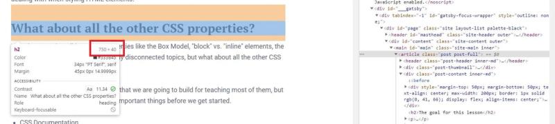
When using Firefox (or any browser) developer tools, the numbers that you see when you hover over HTML elements are expressed in pixels regardless of how you originally defined them.
While we are talking about pixels, I want to revisit something we talked about in the prior lesson on the DOM. Remember when we talked about these built-in properties?
window.innerHeight; // The webpage height in pixels
window.innerWidth; // The webpage width in pixels
As of right now, we only know how to find these numbers using JavaScript, but they are also available to us with CSS! To use these in CSS, we can write the following lines of CSS.
.some-element {
  width: 100vw;
  height: 100vh;
}
By using vw ("viewport width") and vh ("viewport height"), we can assign elements to have dimensions equal to the entire width or height of the visible webpage. By putting 100 in front, we are saying, "Make this element 100% of the current viewport height/width".
You won't have to use this often, but it will come in handy.
Percentages
Take a look at this brainteaser.
Read through the HTML and CSS and then ask yourself–if we have assigned a width of 100% to the .progress-bar div, then why is it not equal to the width of the main container?
The reason is because when defining dimensions using percentages, these percentages are relative to the parent element.
In this case, .inner-container has a width of 150px, while .container has a width of 200px. Since .progress-bar is the child of .inner-container, it will have a width equal to 100% _ 150px, NOT 100% _ 200px;
But...
If the parent container does not have a width defined, then the percentage will be relative to the first parent that does have a dimension defined. If we remove the width property from .inner-container, then our progress bar will be equal in width to the main container.
This seems complicated, but percentages are used heavily when we want to make our web applications responsive on all devices. We won't talk much about responsive web design here in this tutorial, but consider what would happen if you defined an HTML element to have a width of 900px. Mobile devices are usually between 400-500 pixels, which means the element that you have defined will overflow out of the visible screen (the "viewport") when your user sees it on a mobile device. If we instead defined the width of this element as something like 90%, we no longer have this problem. We will talk more about this concept later, but let's keep moving for now.
rem and em Units
These measurements are specific to font sizes. We will soon cover font properties, but first let's understand how we measure the size of them. Here are three ways that we can define the size of a font.
body {
  font-size: 16px; /* 16px is a "standard" value for normal text on most webpages */
}
body {
  font-size: 1em; /* 100% of the parent element's font size */
}
body {
  font-size: 1rem; /* 100% of the root element's font size */
}
The first case is simple, and oftentimes, you'll see it used on the root element, html. The subsequent two methods define the font size based on either the parent element or the root element. Let's say we had the following HTML and CSS.
<html>
  <head></head>
  <body>
    <p>Paragraph #1</p>
    <p class="smaller-text">Paragraph #2</p>
  </body>
</html>
html {
  font-size: 16px;
}

/* Since the root font size is 16px, 1rem equals 16px */
body {
  font-size: 1rem;
}

/* Since this element's parent, `body` has a font size
of 16px, this will have a font-size of 0.8 * 16 = 12.8px */
.smaller-text {
  font-size: 0.8em;
}
This example, although contrived, is a common way of defining font sizes. We define the root element a hardcoded pixel value (usually 16 pixels), and then define elements within the html font sizes relative to that root font size.
Color Codes and CSS Properties
I'm not going to get too detailed here; just give the basic overview.
Here are the most common color-related CSS properties.
color- defines the text color of the container or elementbackground-color- defines the background color of the elementborder-color- defines the border color
And here are four valid ways to define a color.
green- a built in valuergb(0, 255, 0)- RGB stands for "red", "green", "blue". Valid values are from 0-255, which is equal to one byte.#00ff00- The "hex" or "hexadecimal" version of the color. The first two characters represent red, the second two green, and the third blue.rgba(0, 255, 0, 0.8)- Same thing as RGB, but the last number represents the transparency value. In this case, we are defining 80% transparency.
While the built in colors like "green" or "blue" are just part of CSS, we can easily convert back and forth between RGB and Hex. It is simply a matter of converting binary to hexadecimal and vice-versa. There are plenty of online converters you can use to do this.
And one more thing while we're here–check out Adobe Color as a tool for building color themes and working with these color codes.
As a quick review, if we wanted to make all paragraph elements a sky blue color, we could do this:
p {
  color: #16a6f5;
}
Or this...
p {
  color: rgb(22, 166, 245);
}
Or this...
/* Here is a list of color keywords - https://developer.mozilla.org/en-US/docs/Web/CSS/color_value#color_keywords */
p {
  color: lightblue;
}
Font Properties
While we have already covered the font-size property, there are a couple other important font properties to be aware of.
font-family- defines the font that your webpage will usefont-size- defines the size of the fontfont-weight- defines the thickness of the font (i.e. regular, bold, etc.)line-height- defines the spacing between lines of text
In most cases, you'll see the font-family and font-size defined at the root element, html.
html {
  font-family: "Georgia", serif;
  font-size: 16px;
}
The first part of the font-family property represents the actual family (i.e. "Georgia") while the second part represents the generic family (i.e. "serif"), which acts as a fallback value in case the main family is not able to load correctly in the webpage (usually due to unsupported fonts on certain browsers).
For a list of font families and fallbacks, this W3 page is a good reference.
But what if you're not happy with the built-in browser fonts? Adding a custom font can be done in a few different ways, but the most straightforward and common way is by adding a link tag in the head of your HTML document; just like you would a stylesheet.
Let's say we wanted to add the Roboto font family to our webpage. Head over to Google Fonts and copy that link tags you see on the right side of the page. It should look like this.
<link rel="preconnect" href="https://fonts.gstatic.com" />
<link
  href="https://fonts.googleapis.com/css2?family=Roboto:wght@400;900&display=swap"
  rel="stylesheet"
/>
Before we wire these up to our HTML document, I want to point out one important thing. You can see in the href attribute, we have font weights of 400 and 900 selected. In other words, we can use the font-weight property with values of 400 and 900 to change the thickness of our text. Let's go ahead and wire it up now.
<html>
  <head>
    <title>My Webpage</title>
    <link rel="preconnect" href="https://fonts.gstatic.com" />
    <link
      href="https://fonts.googleapis.com/css2?family=Roboto:wght@400;900&display=swap"
      rel="stylesheet"
    />
    <link href="./path-to-stylesheet.css" rel="stylesheet" />
  </head>
  <body>
    <p>Paragraph #1</p>
    <p class="bold-text">Paragraph #2</p>
  </body>
</html>
Now, all we have to do in our stylesheet is this:
html {
  font-family: "Roboto", sans-serif;
  font-size: 16px;
}
And if we wanted to make one of those paragraphs bold, we could do this:
.bold-text {
  font-weight: 900;
}
Here is a Codepen showing this in action. Please note that the process of adding a custom font family in Codepen is slightly different because the HTML code editor represents the body and not the html document. Just go to Settings->HTML and paste the link tags into the "Stuff for head" section.
Background Properties
Whether we are talking about background colors, background images, or how these backgrounds are positioned, the following CSS properties are really helpful to keep in the back pocket.
Each of these properties will affect the content area of the Box Model (including padding, but excluding border and margin).
background-color- changes the color of an HTML elementbackground-image- uses an image as a backgroundbackground-position- if using a background image, positions the imagebackground-repeat- determines whether a background image is repeatedbackground-size- changes the size of the background image
Changing the background color is pretty straightforward, but make sure that the element you are styling has a width and a height either explicitly or implicitly. After all, an element that has no dimensions cannot have a background!
<div class="container">
  <div></div>
</div>
.container {
  width: 500px;
  height: 500px;
  background-color: #46d5f2;
}
Adding a background image is a bit trickier. If you are adding a background image, you most likely will be working with a picture, and therefore, you want that picture to fill the entire visible screen (the "viewport"). I have no intention in this massive post to walk you through all the possible combinations, so let's look at an extremely common example that you will see and use.
<div class="container">
  <div class="text-container">
    <h2>Some Centered Large Text</h2>
  </div>
</div>
First, we need to get a high-resolution image (at least 1920x1080, but larger is preferable) for our background. Low-res images will NOT look good on large screens! Here is one from my golf site.
All we need is the image link and we should be set!
/* This is a basic CSS reset.  By default, the body will have
   margin and padding that will prevent our background image from
   taking up the entire screen */
body {
  margin: 0;
  padding: 0;
}

/* Sets the background image */
.container {
  position: fixed;
  width: 100vw;
  height: 100vh;
  background-image: url("https://www.thediygolfer.com/wp-content/uploads/2020/12/homepage-background.jpg");
  background-position: right center;
  background-size: cover;
  background-repeat: no-repeat;
  text-align: center;
}

/* Centers the text container on the page */
.text-container {
  background-color: white;
  width: 200px;
  margin: 200px auto;
  padding: 20px;
  border: 1px solid black;
}
There is a lot going on here, I know. What I want you to focus on are the following things.
- I have set the
.containerto have a100vhand100vw. This ensures that the HTML element with the background occupies the entire visible webpage, or the "viewport" - I have set the margin and padding to 0 for the
bodyelement to remove browser default styles that will prevent our background from occupying the entire page. Go ahead and remove this block of code in the Codepen and see what happens. - Each of the background properties have a set of possible values. These are good defaults. The only property that might be worth changing is the
background-positionproperty depending on what parts of your image you want to be shown. - Everything else that I didn't comment on will become part of your "CSS vocabulary" with practice (and I will likely cover them in the code challenge for this lesson).
Here is the end result. I highly suggest clicking through this and removing CSS properties one at a time to see what they do to the overall webpage.
Writing Shorthand CSS
And finally, the last thing I want to cover here is something that might be confusing to you like it was me when I was starting out. Many of the CSS properties that we have covered have "shorthand" ways of writing them. When talking about the Box Model, we can define a border around an element.
.some-element {
  border: 1px dashed black;
}
This creates a 1 pixel, dashed black line as a border. But...
We could have written this across three separate properties.
.some-element {
  border-width: 1px;
  border-style: dashed;
  border-color: black;
}
In other words, the first way was the "shorthand" way of writing this CSS rule. We can also do this with other properties like margin. Here's the long way to define margin for an element.
.some-element {
  margin-top: 10px;
  margin-right: 5px;
  margin-bottom: 2px;
  margin-left: 15px;
}
Here's a shorter way to write the same CSS.
.some-element {
  margin: 10px 5px 2px 15px;
}
And if you want the same margin value on all sides, this is all you have to do.
.some-element {
  margin: 20px;
}
As you write CSS, you will pick up on these "shorthand" ways of writing it. I know it is confusing now and tough to remember what to use and when, but if you are ever lost, remember, you've got the documentation available to you!
A Systematic Way to Write CSS Effectively
In my experience, the real key to using CSS effectively is to ask the following four questions in order, every time you style a webpage. These will become second nature eventually.
- How do I want to arrange these HTML elements on the page?
- How does this arrangement look in the form of HTML?
- How can I use CSS to achieve the layout I have imagined?
- How should each element be styled?
Talking about CSS in isolation isn't helpful. We have to consider the HTML part too.
I'm going to walk you through these four questions using an example similar to the one below. Take a look at the webpage we looked at earlier:
Step 1: How do I want to arrange the elements?
In the example above, my goal is to have two boxes, horizontally arranged side-by-side with text in them.
Step 2: How does this arrangement look in HTML?
Since I have two boxes, I probably need two div elements. These div elements are perfect "containers" for things like this. I also need a "main" container, so I'll wrap everything in another div.
Furthermore, I need a heading and some paragraph text in each box. The most basic representation of this layout in HTML would be:
<div>
  <div>
    <h2></h2>
    <p></p>
  </div>
  <div>
    <h2></h2>
    <p></p>
  </div>
</div>
Of course, I need to put some text in the h2 and p elements and add a few classes to the elements (so that I can select them easily with CSS), but this represents the "skeleton" that I'm trying to imagine in this step.
Step 3: How can I use CSS to achieve the layout I have imagined?
In this step, we're focusing on getting those HTML elements arranged in the correct spots on the webpage. We are NOT worried about how pretty they look yet.
Unfortunately, this step is where experience using CSS comes in handy. There are several "layout" CSS properties to use here, and we can actually achieve the same result in a couple different ways. Since I will be walking through these properties later, I'm going to just give them to you now.
But the first thing we need to do is modify our HTML so that we have the necessary selectors ready to use! Here's how I would modify it.
<div class="container">
  <div class="box-1">
    <h2>Box 1</h2>
    <p>some text</p>
  </div>
  <div class="box-2">
    <h2>Box 2</h2>
    <p>some text</p>
  </div>
</div>
Sure, I could have used ID attributes instead of classes, but in this example, it doesn't matter. We just need something that will make writing our CSS easier. Here is how our HTML looks without CSS layout properties (I added borders so you can visualize it better).
By default, these will be stacked on top of each other vertically (we'll talk about why later). Since we want them to be arranged horizontally, we need to add some CSS. Here's one way to do it:
.box-1 {
  float: left;
  width: 50%;
}
The float property will break the first box out of its "natural" layout and the width will make it take up 50% of the page. This is the easiest way to achieve our desired result, but as you start writing more and more CSS, you'll realize that using the float property for layouts is very cumbersome and produces some unexpected results. In the next lesson, we will learn about Flexbox, which is how I would prefer to achieve this layout. Don't worry about how this works yet.
.container {
  display: flex;
  flex-direction: row;
}

.box-1,
.box-2 {
  flex: 50%;
}
Here is our result after adding this CSS.
At this point, we have successfully arranged the items in the right place on the page.
Step 4: How should each element be styled?
The last step is in my opinion, the easiest. All we have to do now is take our elements that we have arranged on the page and give them nice colors, borders, spacing, etc. Let's add the following CSS to our existing webpage.
.box-1,
.box-2 {
  flex: 50%;
  text-align: center;
  margin: 20px;
  padding: 20px;
}

.box-1 {
  border: 2px solid green;
  color: green;
}

.box-2 {
  border: 2px solid blue;
  color: blue;
}
Starting from the top, we have added a text-align property which will center all the text elements inside our div containers. We also added margin and padding (will talk about this in a minute), which just spaces things out nicely. We then add a green border and color (font color) to the box-1 class and the same properties in blue for box-2.
Here's our final result.
A Project to Learn CSS
Like most things in web development, the only true way to digest this stuff is to build something. Instead of giving you a boring overview of all the possible CSS properties, we're going to use what we've learned in this lesson and start building something real.
The challenge that we are doing is from a site called Frontend Mentor, which provides really nice UI designs (that I could not design myself) and presents them as HTML/CSS/JS challenges.
Here is the challenge that we will be completing.

Since we know how to write JavaScript, HTML, and now CSS, we should be able to complete this entire challenge! I will be releasing some supplemental CSS videos on responsive web design, Flexbox, and CSS grid, so I suggest supplementing this challenge with those videos and trying parts of it on your own. I would not expect you to be able to build this on your own, but there will be many opportunities throughout to pause the video and try it for yourself.